Chetwood

Uniting four firms under one refreshed, modern identity
Chetwood had grown quickly, acquiring four separate businesses and consolidating them under one roof. With £900m in assets under management, they needed a brand that reflected their scale while uniting different services and client groups under a single, modern identity.
The existing look was well-established but beginning to feel dated. Our role was to evolve and modernise without alienating their long-standing clients.


One Company, One Culture, One Brand ... One Chetwood
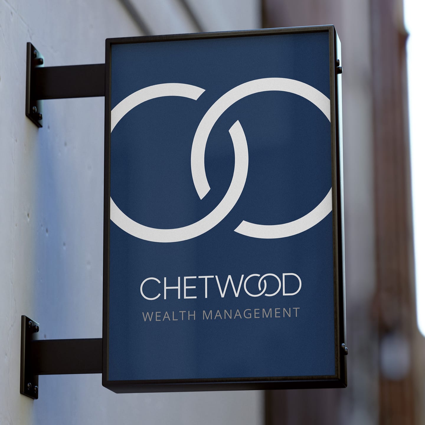
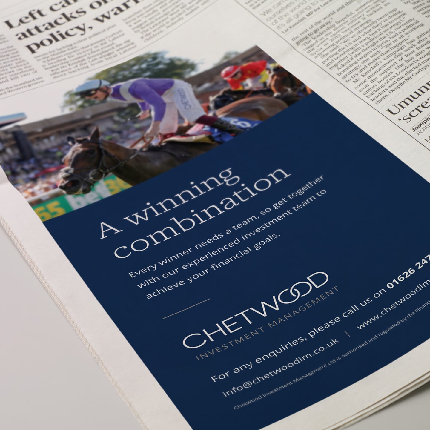
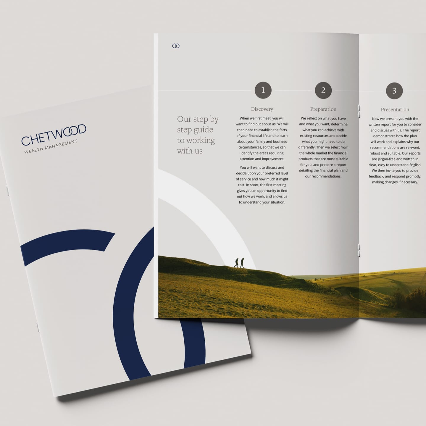
At the heart of the brand refresh was the “One Chetwood” idea. We modernised the main Chetwood identity, updating colourways and typography while retaining the distinctive linked “OO” mark — a recognisable element with significant brand equity. Alongside this, we created a cohesive family of sub-brands for Chetwood Private Wealth, Chetwood Wealth Management, and Chetwood Review Service, each serving a different client segment from ultra-high-net-worth to mass affluent and light-touch clients.
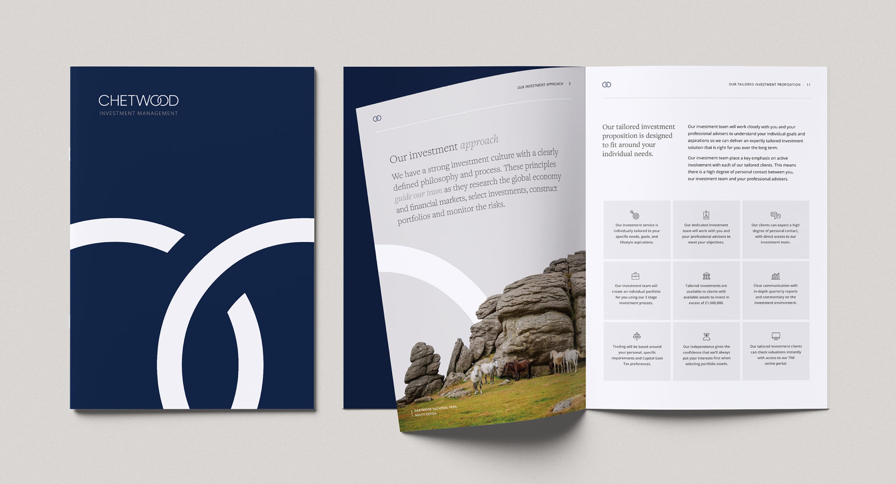
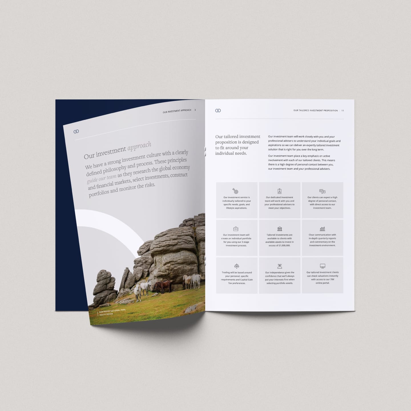
To bring consistency across all materials, we developed a suite of South West lifestyle imagery treated with a distinctive tonal approach. Each image carried the subtle curve from the Chetwood “O” brand mark, tying them visually to the identity. This treatment ensured every asset felt premium, realistic and coherent, particularly in printed assets.
Project deliverables
Developing Chetwood’s visual language with images and graphics
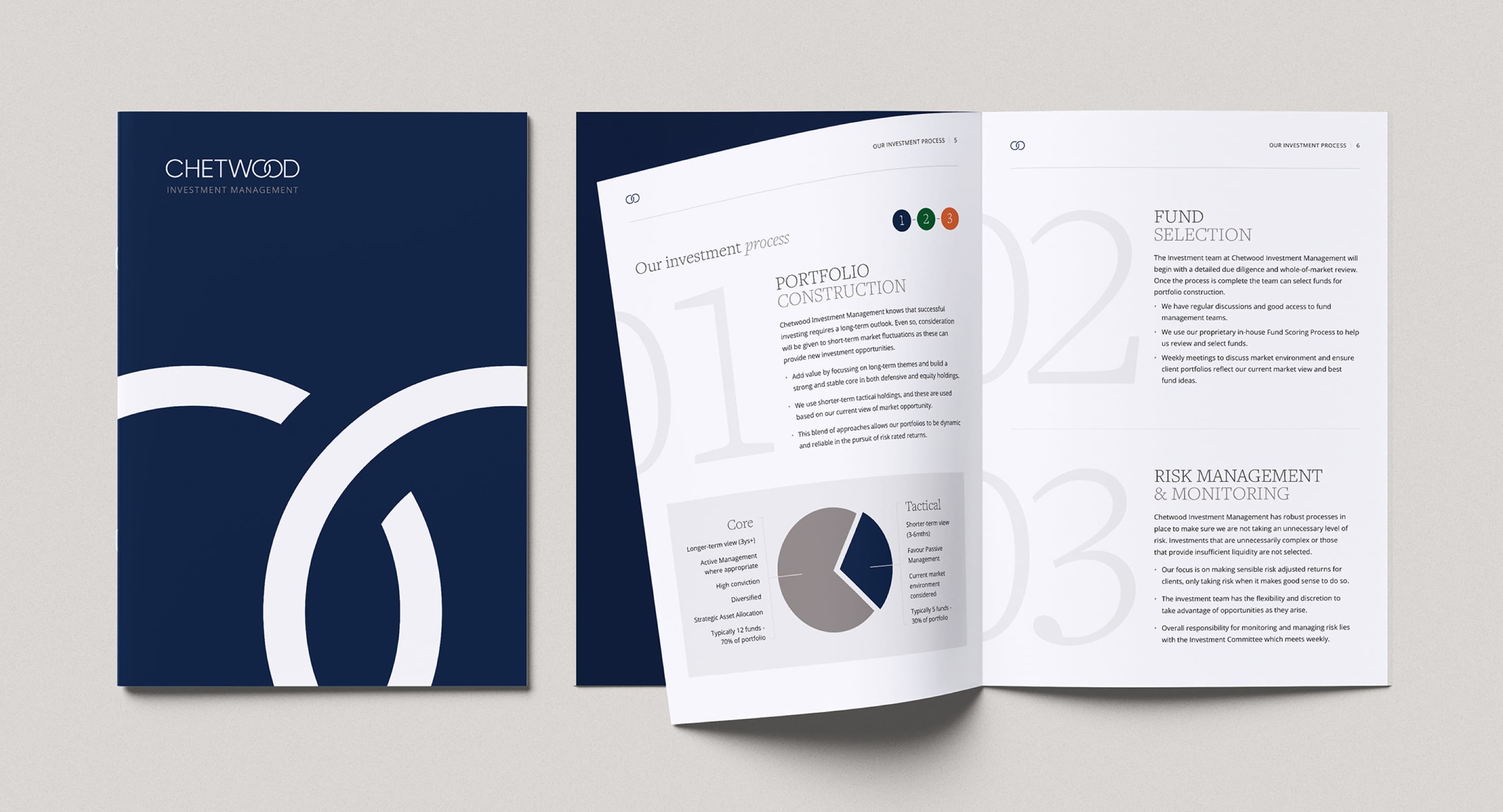
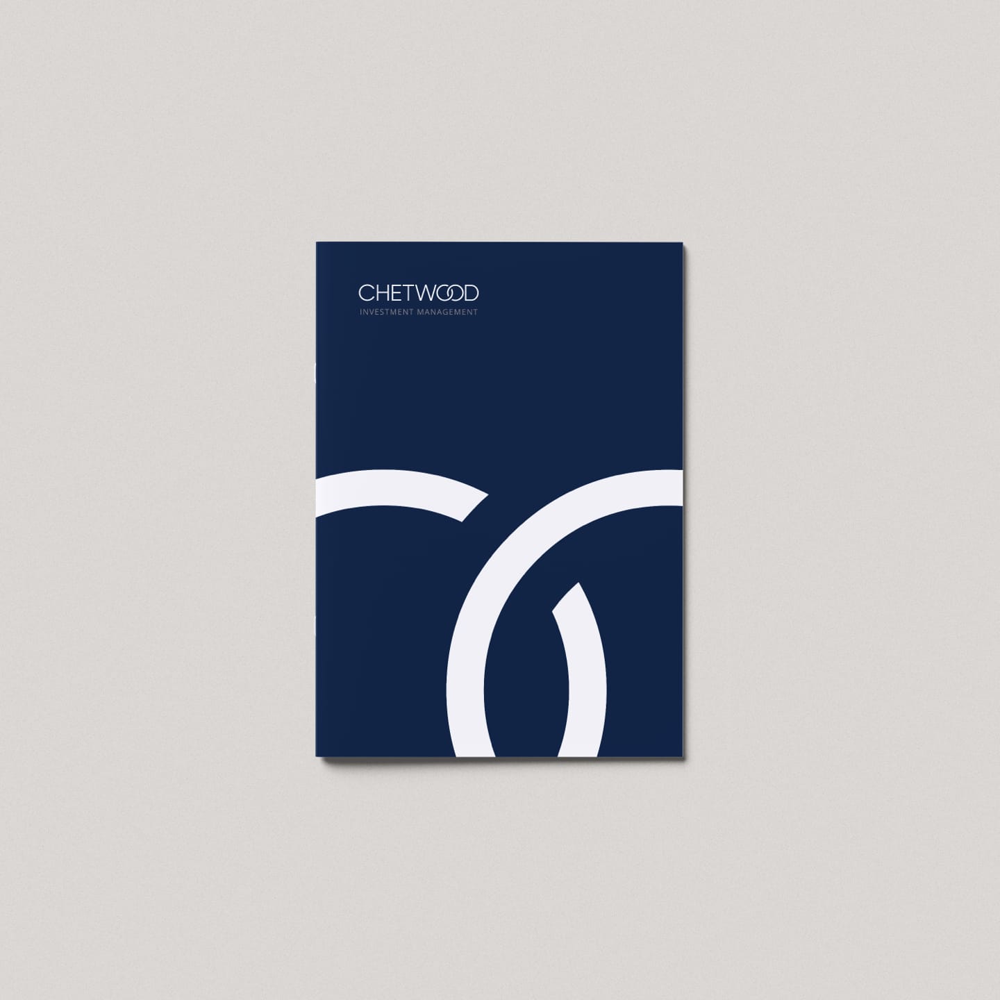
The brand refresh came to life in the main company brochure, a premium, perfect-bound piece with a dark blue card cover and a white foil graphic mark. Printed on uncoated stock, it set a tone of quality and confidence for Chetwood’s HNW clients. Our Creative Director integrated the treated lifestyle imagery throughout, balancing the visual identity with essential information. Copywriting support ensured the tone remained consistent, clear and authoritative across every page.
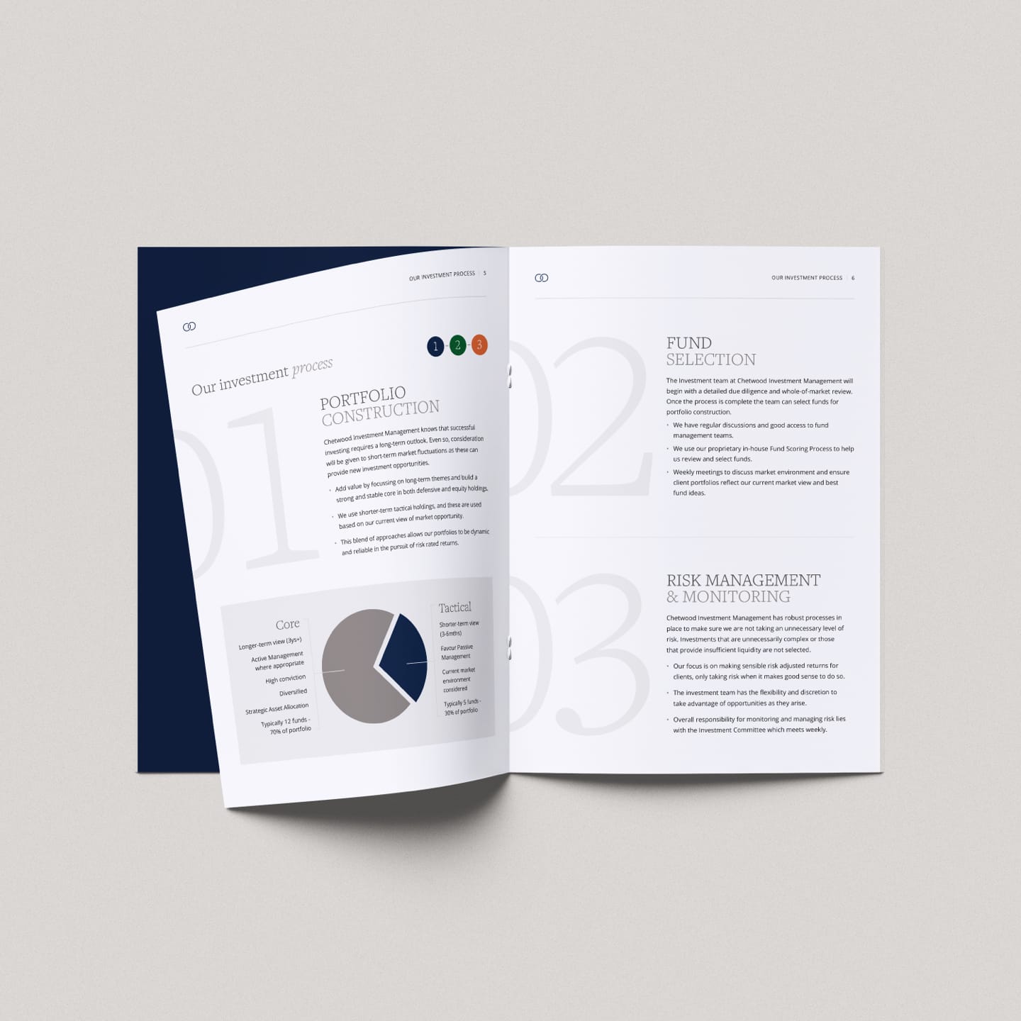
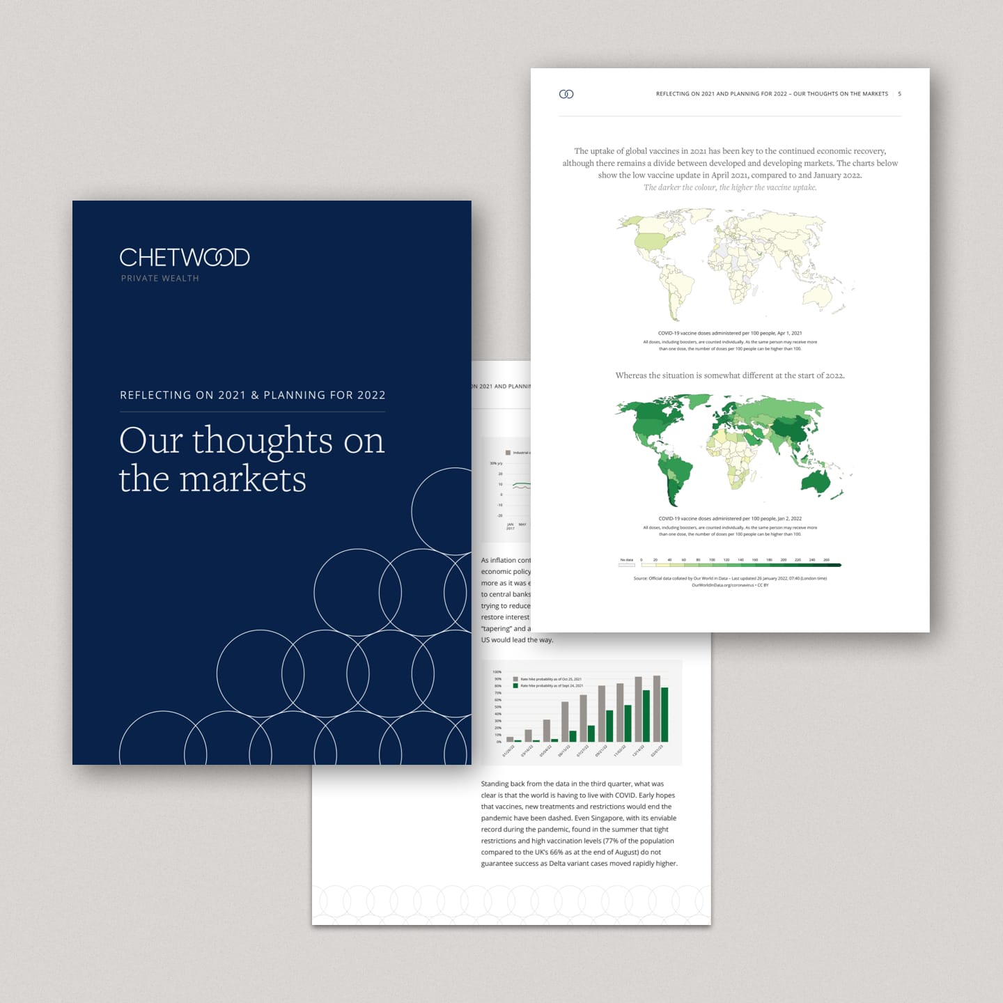
The next major application of the refreshed identity was the Annual Investment Review, designed to be similar in style to the main brochure, but slimmer and stapled to differentiate. We restructured supplied content into clear, engaging quarterly sections, highlighted key statistics and commentary, and paired them with the new imagery suite. The resulting documents both inform and build trust, positioning Chetwood as a client-focused business with a modern, confident brand.


The impact of this work goes beyond design
Chetwood was recently acquired, with assets of £900m AUM. A strong, modernised brand not only united four businesses under one identity but also played a role in maximising their value and saleability at exit — proof of just how powerful your brand can be.
Ready to chat about your business?
More of our case studies